You will start to see our new logo roll out across our website and platform over the next few days.
A lot goes into creating a new logo and our lead designer, Rachel, our lead designer, did an amazing job creating our new brand!
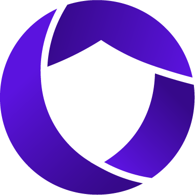
From Rachel:
As a company grows and evolves, so should its brand. Rownd has changed significantly since the initial logo was created, so it was only fitting to ensure the logo kept up to best reflect the values and purpose of Rownd. I believe the best way for fast, quality design is through rapid iteration; sharing ideas at low fidelity allows for quick feedback early in the process that shapes and molds a good outcome faster.I started on this new revolution of the logo by combining initial feedback from the team. We wanted something that could reflect security, trust, ownership, but also something that could be a little abstract. While thinking about symbols that represent these values: lock and key, shield, circle of trust, I sketched out many small ideas. From there, I created my favorite ones in black and white in Adobe illustrator, and immediately shared those ideas with the team in slack. Through these loops of feedback and iteration, we came to this new logo fairly quickly. The circle’s 3 parts represent ownership, privacy and security; these 3 shapes outline a shield in the middle to reiterate those values in the well-known symbol for security, privacy and trust.